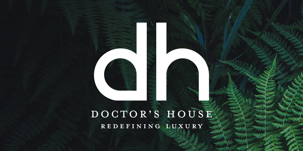
New Logo Release: The Doctor’s House
Jul 3, 2019
Redefining Luxury
We are excited to announce a rebrand for a premium wedding destination in Green’s Harbour, Newfoundland and Labrador. The Doctor’s House Inn & Spa features 100 acres of various plants, flowers, trees, and farm animals, along with a luxury inn, restaurant, spa, wedding garden, event barn, walking trails, and a beach.

BRAND STORY
The Doctor’s House is a historic property located in Green’s Harbour that was started more than half a century ago by a young doctor and his wife, both of whom had a talent for gardening and a love for animals.
The logo makes use of a clean and simplistic design scheme. The font style is clear and concise in its presentation. The colour is bold and classy so as to not pigeonhole the brand. The ‘dh’ is used to subtly identify it as an award-winning inn, spa, and restaurant.
ICON
The icon for the brand is a minimalistic version of the standard logo.
![]()
THE COLOUR SCHEME
The colour used in the logo is contemporary and sharp. Black is associated with sophistication, elegance, class, modernity, timelessness, and formality. The logo’s tone and saturation is designed to provide adequate contrast for printing on a variety of materials and colours.
BRAND VOICE
The Doctor’s House represents a unique approach to luxury, whereby the product skirts traditional notions of luxury and instead opts for a redefined version. This redefinition of the term is focused on offering a one-of-a-kind experience and doing it exceptionally well. The brand recognizes the legacy of the property it’s situated on, as well as the storied and illustrious past of Newfoundland hospitality.
AVAILABLE ICON TYPES
The elemental icons for the Doctor’s House represent a place where the elements of experience enhance our well-being. Earth, wind, fire, and water play off of each other to nurture visitors’ mental, physical, emotional, and spiritual states. These icons will be used throughout the website and other marketing collateral as subtle details that will help tie in the teardrop shape found in the logo, as well as reinforce the property’s connection to nature.
![]()
![]()
![]()
![]()
